this is rad stuff, allows you to position one element based on another element, WAIT FOR IT.. without it requiring parent / child relationships like fixed or absolute do. can think of it like pinning one element to another, with rules about which edges to match and stuff 🤓 twitter.com/intenttoship/s…

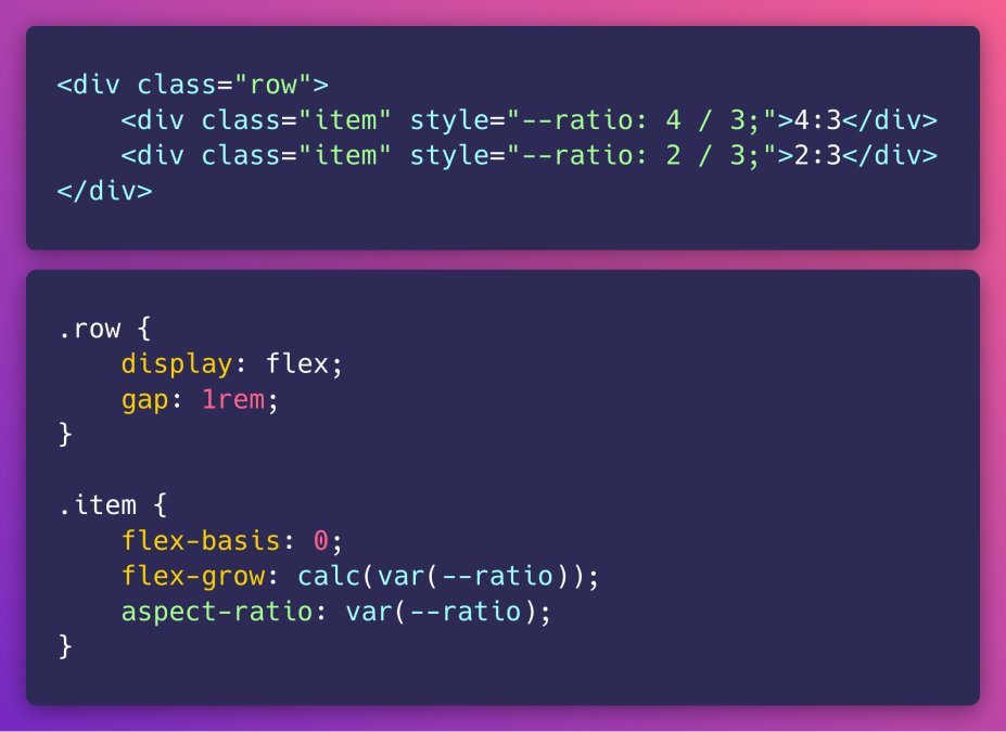
Only a few lines of CSS needed if you want to line up two elements with custom aspect-ratios. 🤯 CodPen Example: codepen.io/enbee81/pen/OJ… More info in this: 9elements.com/blog/combined-… pic.twitter.com/asYpbofu2G
CSS Grid is tricky. But I made some visuals and interactive examples that can help you understand better. A mega thread on CSS Grid layout:
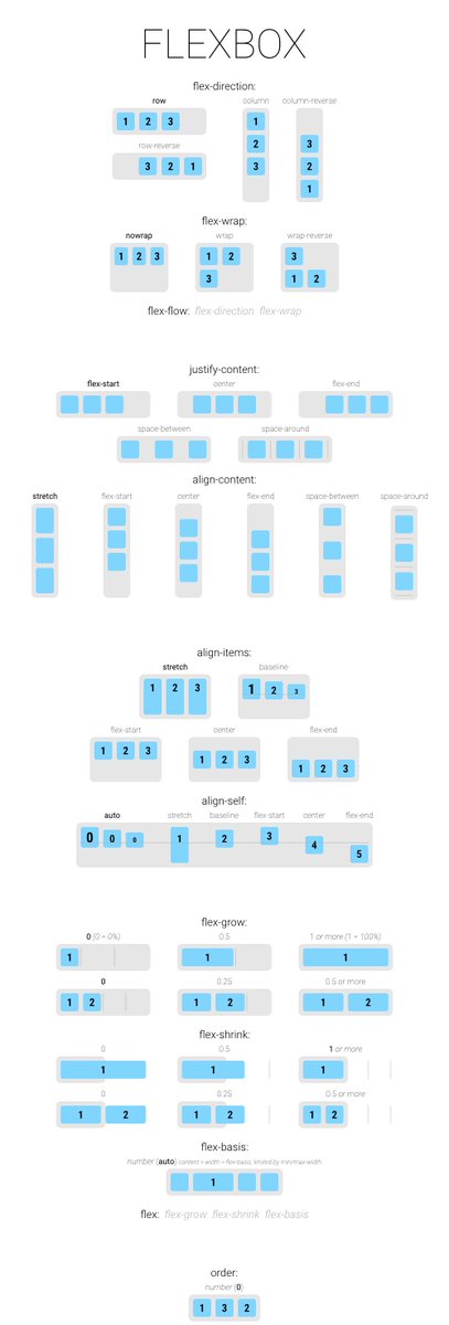
The only CSS Flexbox cheatsheet you need. 💯 ✅ With an interactive web app to learn. see comments 👇 pic.twitter.com/DsIoLmIYnb
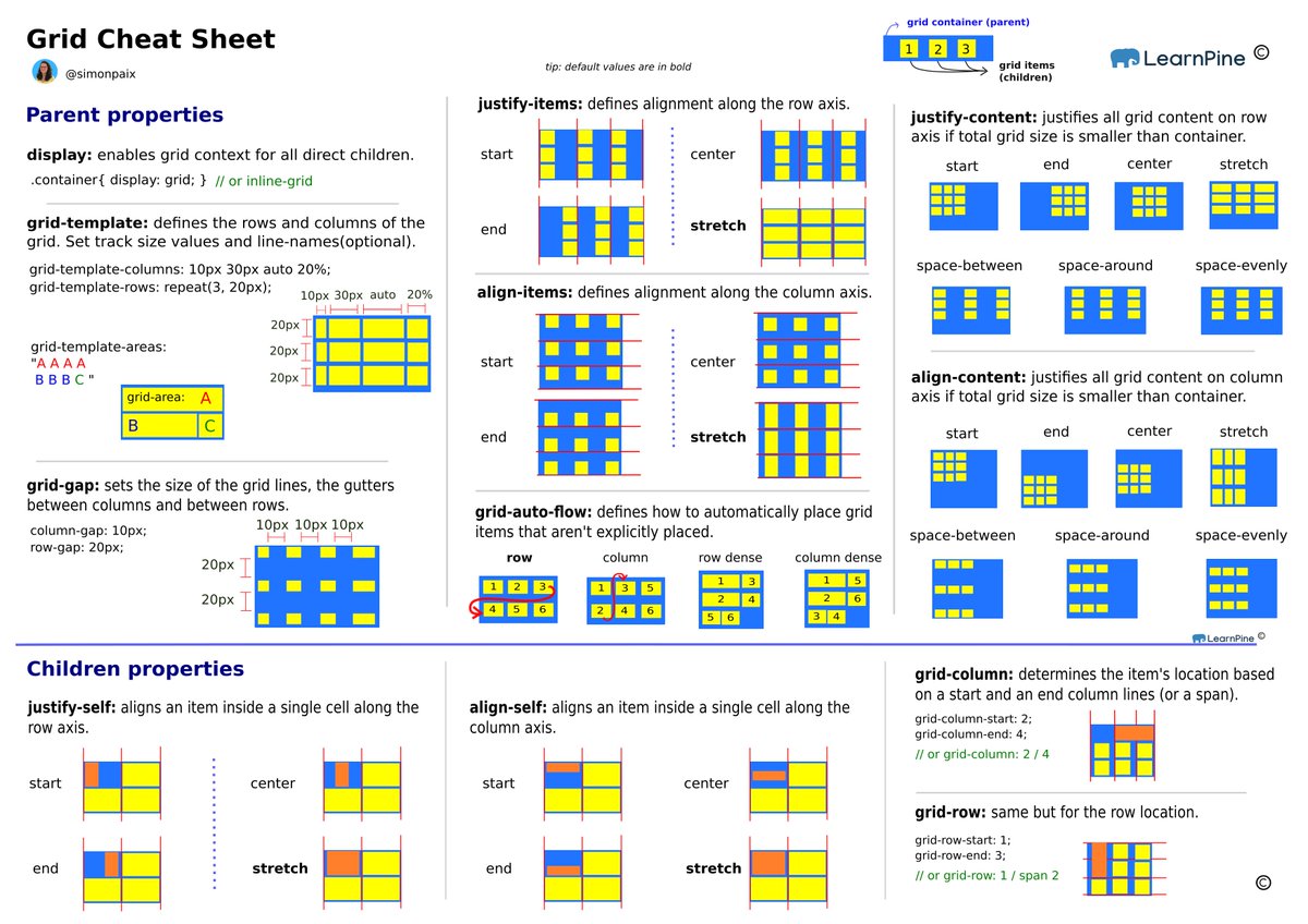
CSS Cheat Sheet for Grid 🔥 pic.twitter.com/z8X1HecHwC

Wow... Okay, so here's something I've been trying to do for at least 10 years! A CSS-only responsive table with fixed column & row headers, inside a layout, with scroll snapping! 🥳 codepen.io/scottjehl/pen/… Works in: Firefox, Safari (iOS & Mac), Chrome (Mobile & Desktop), Edge

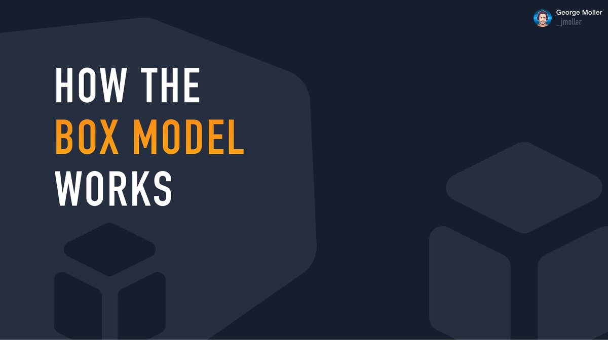
📦 How the Box Model works in CSS 🧵 Thread 👇 pic.twitter.com/DgL9vyhByu