Do this one trick in @jakubkrehel's article about shadows and you'll 10x your design chops. jakub.kr/work/shadows pic.x.com/7bkK8nFB4e
these 4 fonts are fresh ↓ download below pic.x.com/1HbTSUkMMM


I like picnic club font
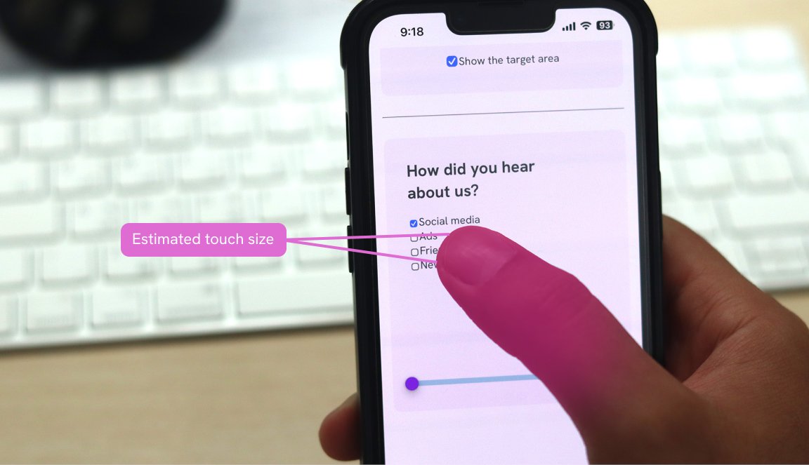
It’s here! 🎉 I’m happy to publish my first interactive guide. It’s about designing better target sizes! The guide is full of interactive demos and illustrations about target size with lots of real-life examples. Enjoy! 🔗 ishadeed.com/article/target… pic.twitter.com/SOxUufSfdt
My favorite lesson from Refactoring UI by @steveschoger and @adamwatham is that “looking good” isn’t all about subjective aesthetic choices. Instead, it’s about organization. For ex: let’s style some info on a banking dashboard with this approach. 🧵
This where I find web inspiration: ⏤ onepagelove.com ⏤ bestwebsite.gallery ⏤ godly.website ⏤ unsection.com/category/foote… ⏤ saaspages.xyz ⏤ siteinspire.com ⏤ maxibestof.one ⏤ typefully.com/saasshots ⏤ dark.design ⏤… twitter.com/i/web/status/1… pic.twitter.com/Nuc2swR1gO
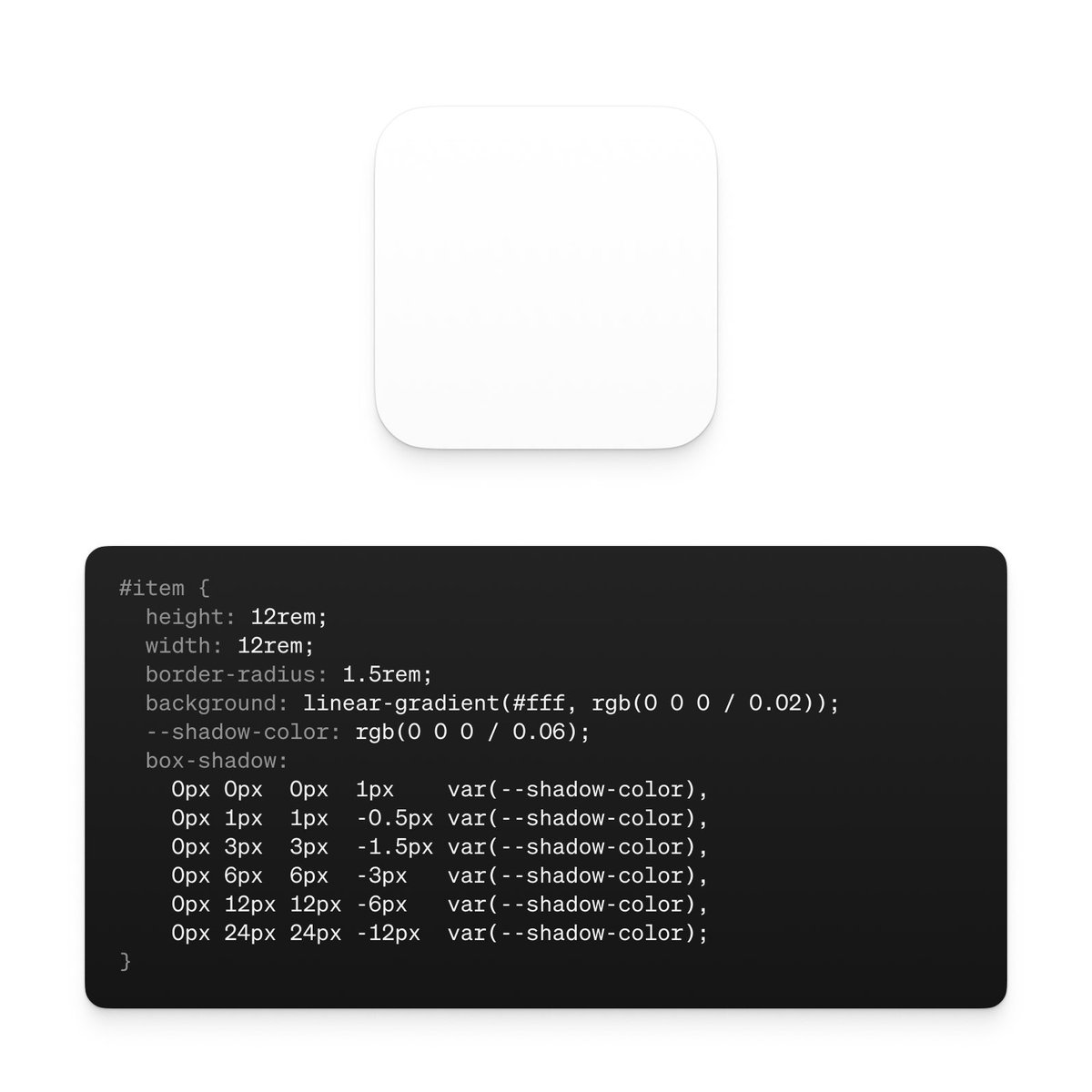
Here’s how to CSS the shadow stack I recently shared. I also put together a little codepen to demo both Tailwind and CSS versions to check out: codepen.io/DerekBriggs/pe… pic.twitter.com/8m39euRXNl
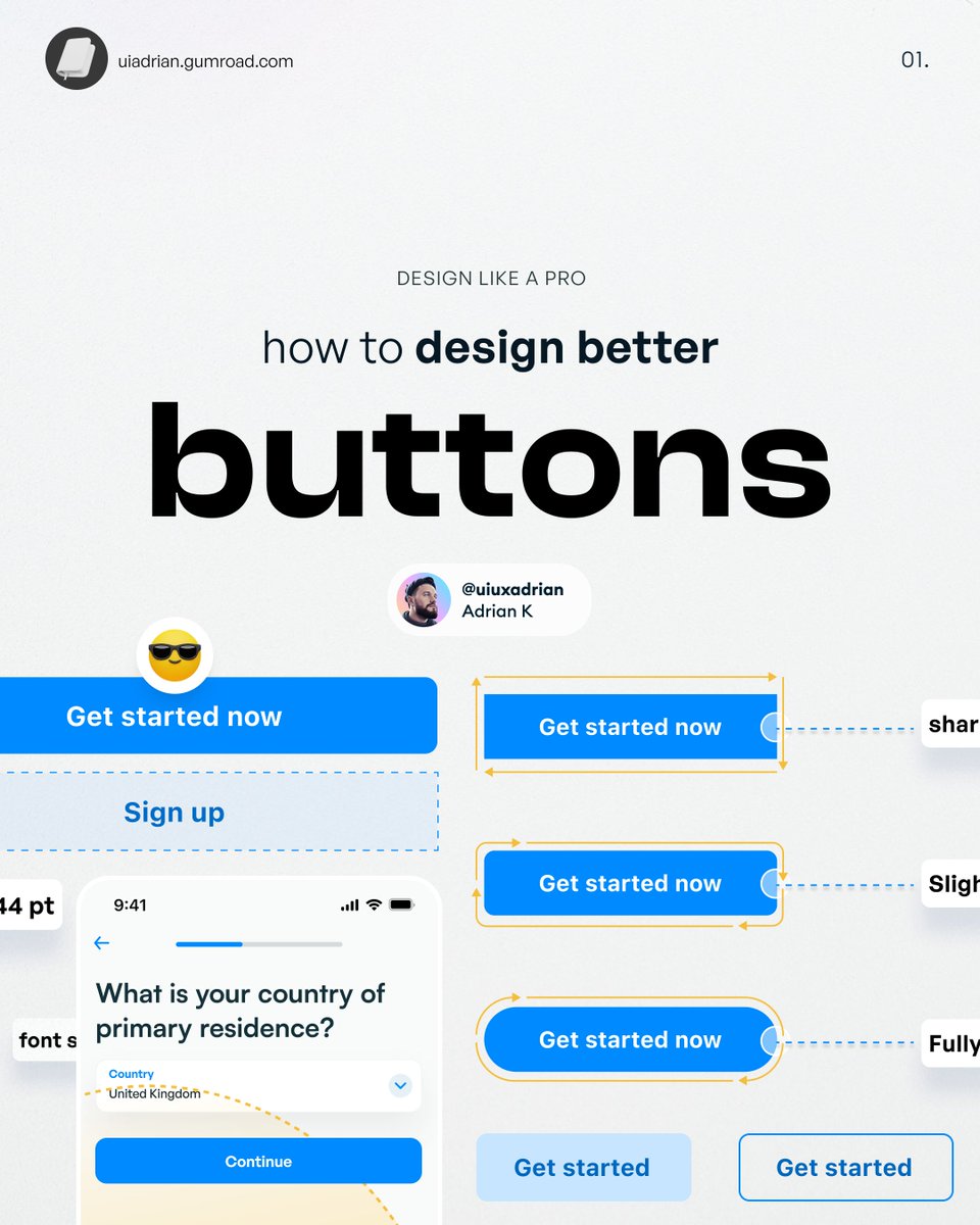
How to design better UI buttons pic.twitter.com/0AbGR7fXeY
My favorite color generator tool ✨🥹 uicolors.app/create pic.twitter.com/0x6a3WMYxw
If you lack color combo idea, Randoma11y is the perfect tool for you 🤓 pic.twitter.com/kHCWpfWeVI

color picker
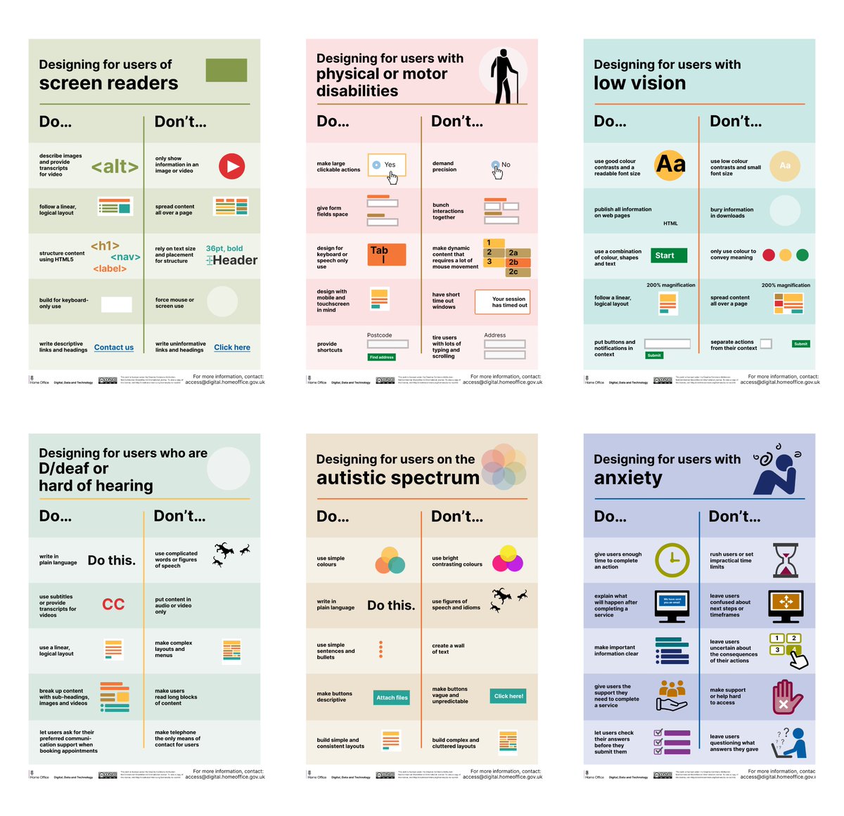
Dos and don'ts on designing for accessibility Tips on how to offer an excellent experience for users with low vision, deaf and hard of hearing, dyslexia, motor disabilities, users on the autistic spectrum, and users of screen readers. 📷: @krwpn pic.twitter.com/W9bT8TsF72
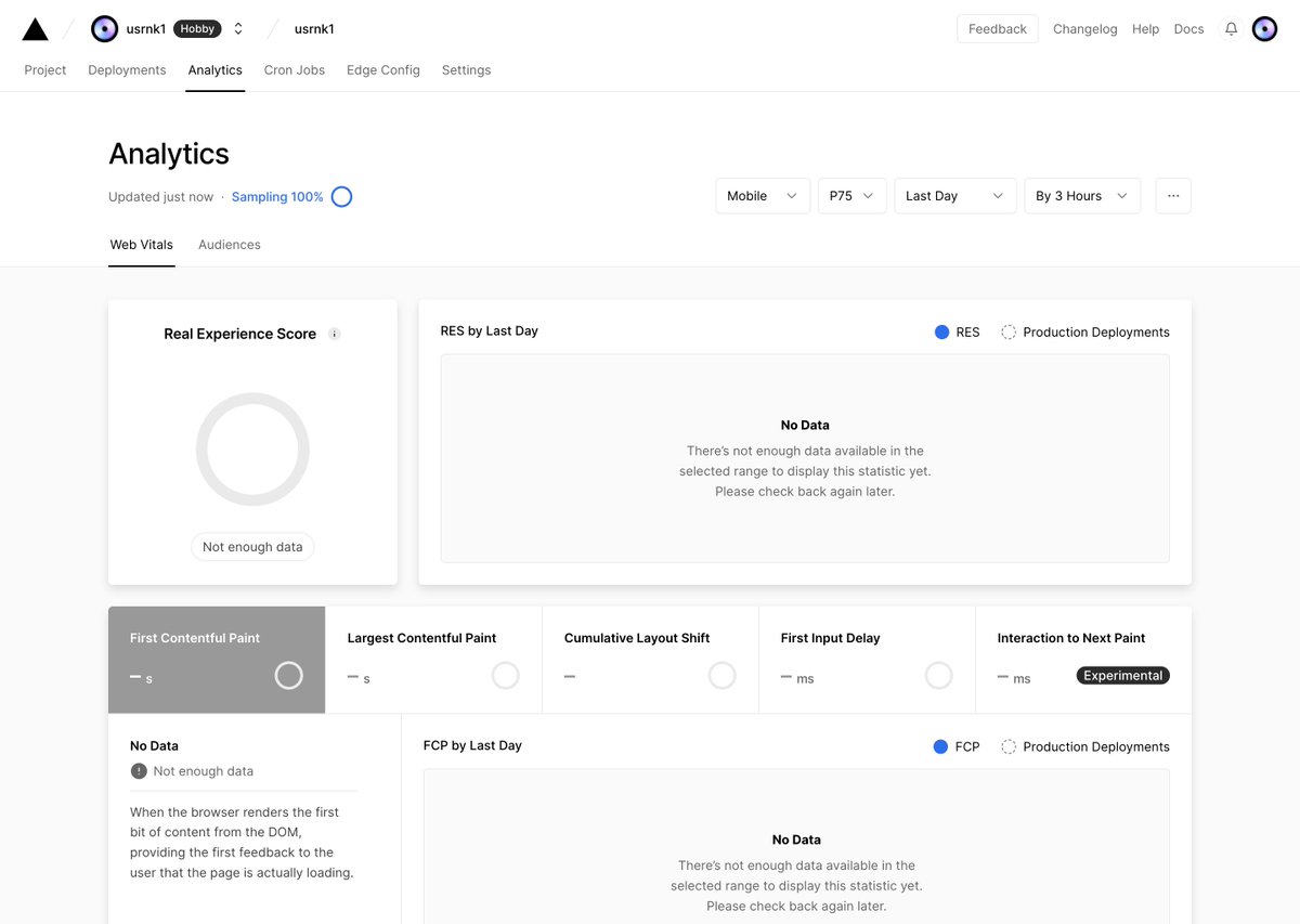
Analytics Empty State View from @vercel pic.twitter.com/uVVLzJxOKp
Here are my favourite websites which I feel are the best in the industry right now! 1. artdirected.design 2. supply.family 3. mockupcloud.com 4. benditomockup.com 5. the-mockups.com/en-gb 6. mockup.maison 7. ls.graphics twitter.com/AlexAperios/st…
30 Tailwind CSS Tips ✨ O N E M E G A T H R E A D ↓ pic.twitter.com/C1AhU0CI24
Awesome collection of free design resources for developers. Grateful to see HTMLrev featured in HTML CSS Templates Thanks to @traversymedia 🙏 github.com/bradtraversy/d…
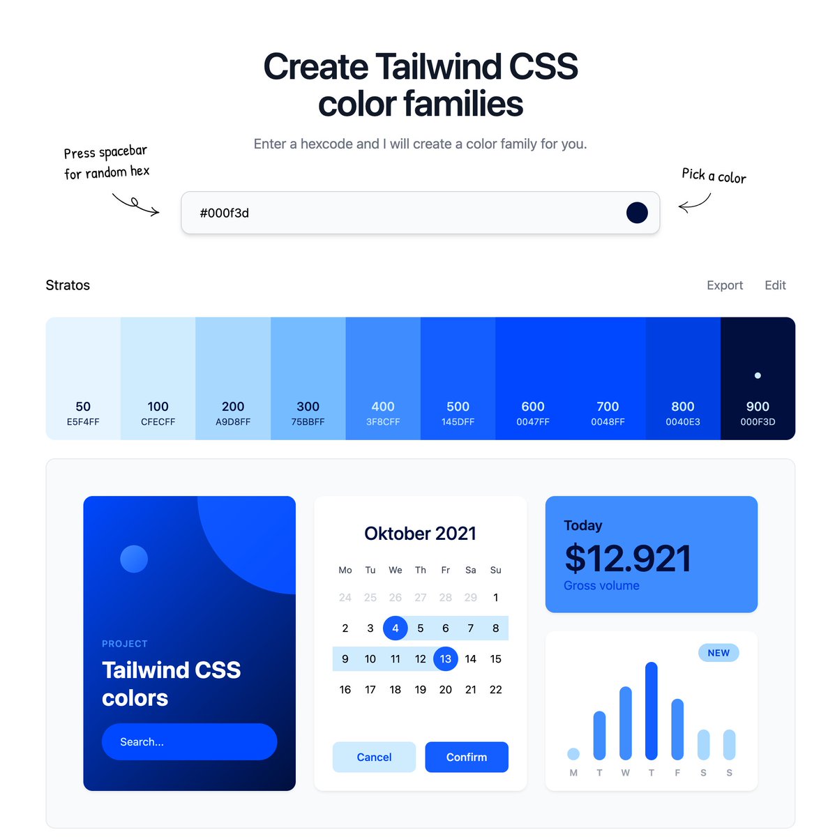
Quick tip everyone using @tailwindcss: With uicolors.app you can easily create a color palette from your brand color 🚀 pic.twitter.com/oMQrHxqecl
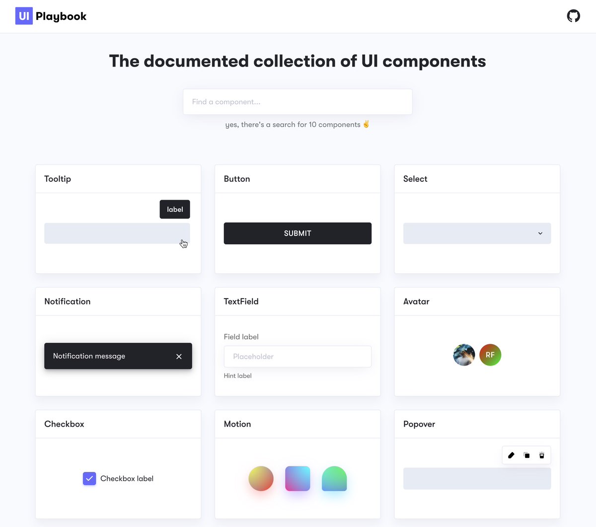
A small but beautiful project by @raunofreiberg: uiplaybook.dev Pattern library of common UI components. With a detailed breakdown of expected functionality, best practices, accessibility concerns, and implementation tips for each. Great example of 💯 design docs pic.twitter.com/mTbPaa8pmp
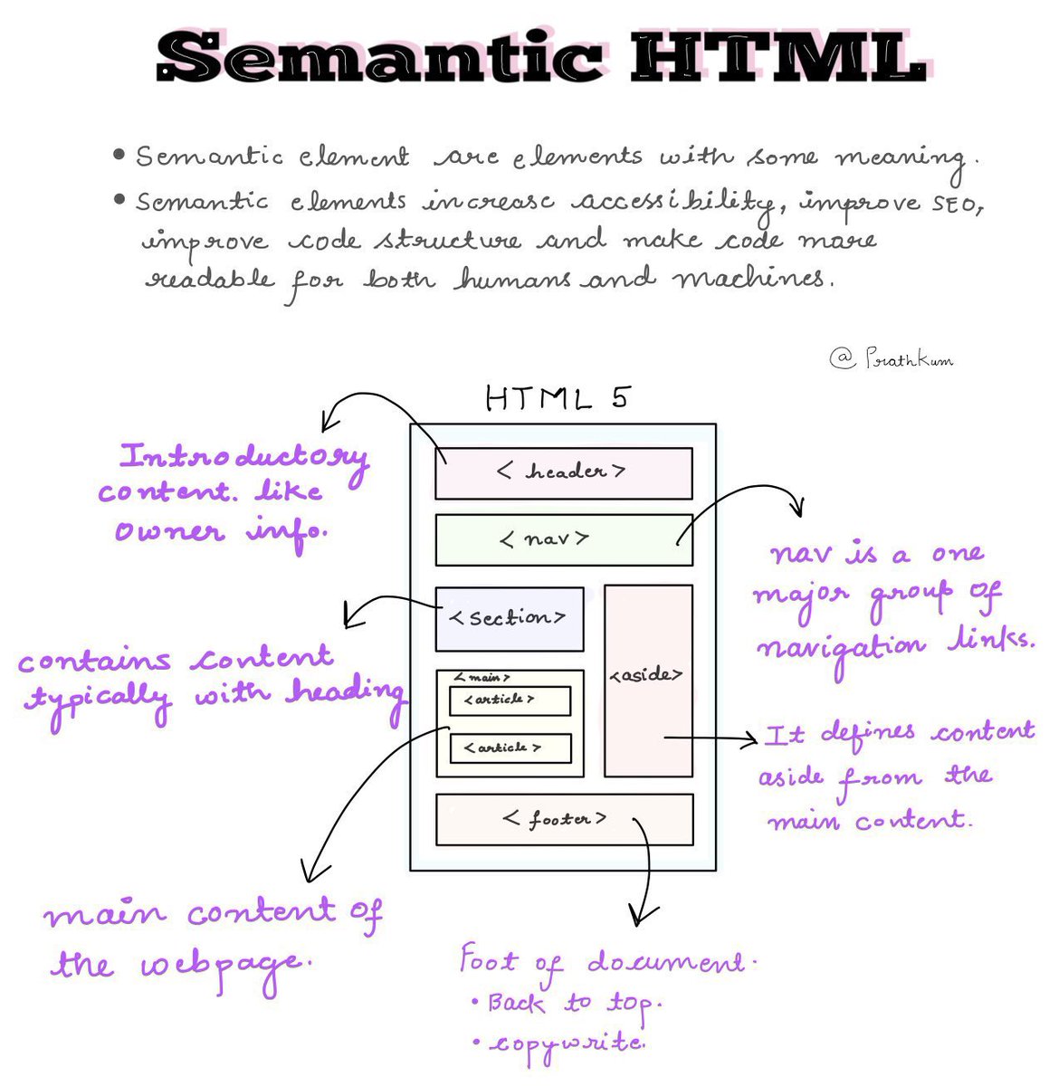
3 handy HTML and CSS notes! pic.twitter.com/g8obzE3UUd
UI/UX design tips Check out happyhues.co , Colour paring made easy 🙂 (cc: @johncjola) #uiux #uidesign pic.twitter.com/9ItZqW6j0x
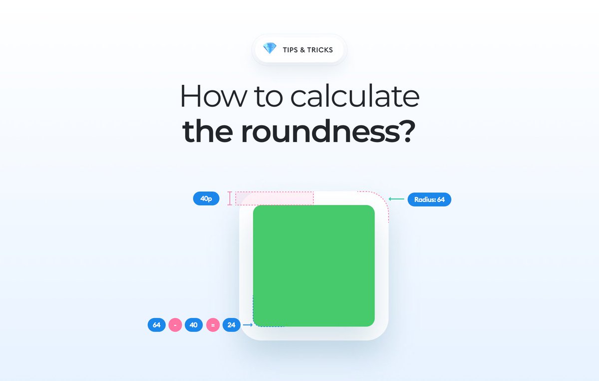
🔥 It's one of those little things that I find extremely annoying in UI. Learn how to properly round the corners of boxes within boxes. A thread 👇 pic.twitter.com/3MjBxGZG0q
Create web development masterpieces with these free CSS generators:
I’m super excited to announce that my ebook has been launched! The content inside this book is a comprehensive guide to designing digital products and entering the design industry. Learn more in the thread below! 👇 Retweets are highly appreciated! 💜 pic.twitter.com/9DMqPfIIfs

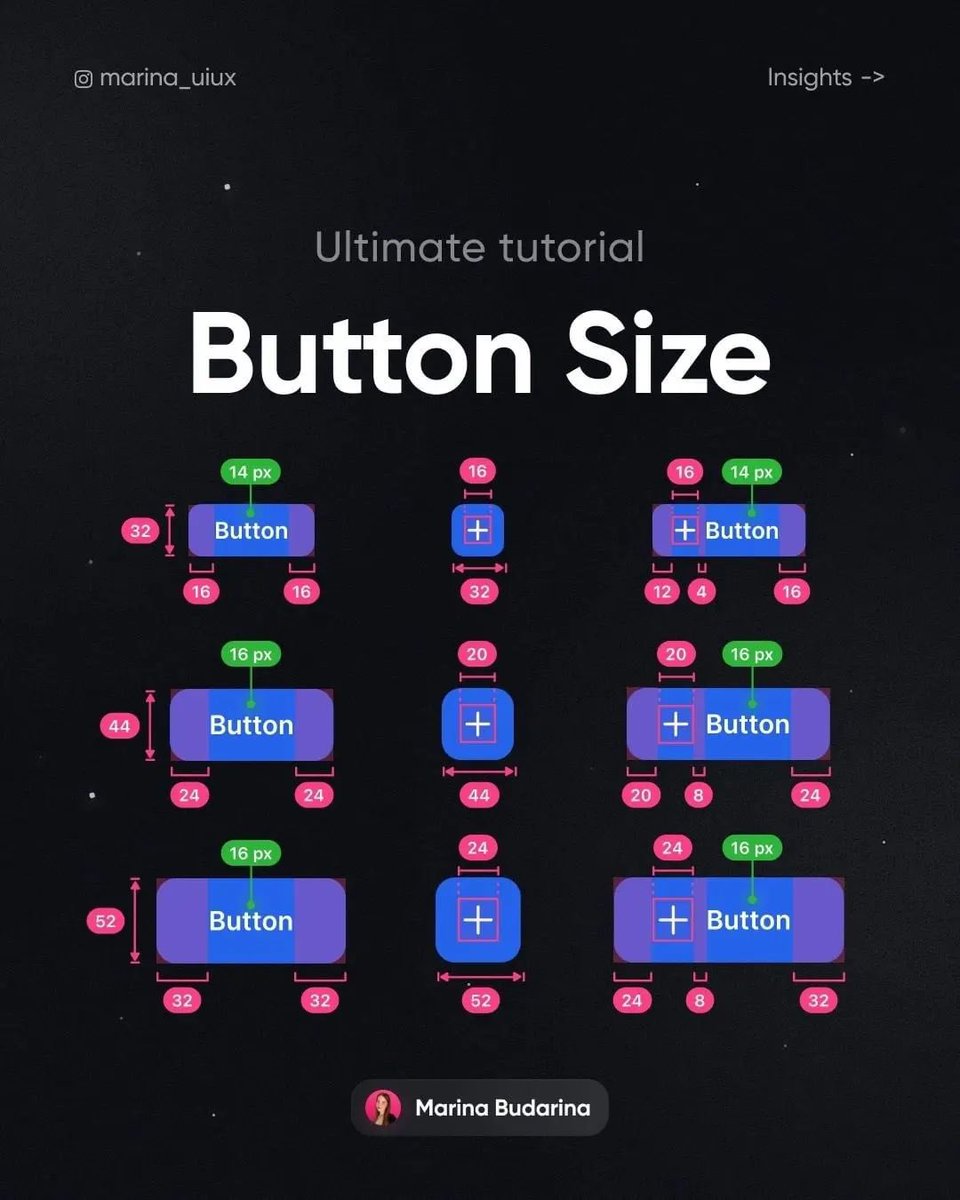
Let’s talk about button sizes tonight before bed! Inspired by Marina instagram.com/marina_uiux?ig… pic.twitter.com/QmAbdECtVf
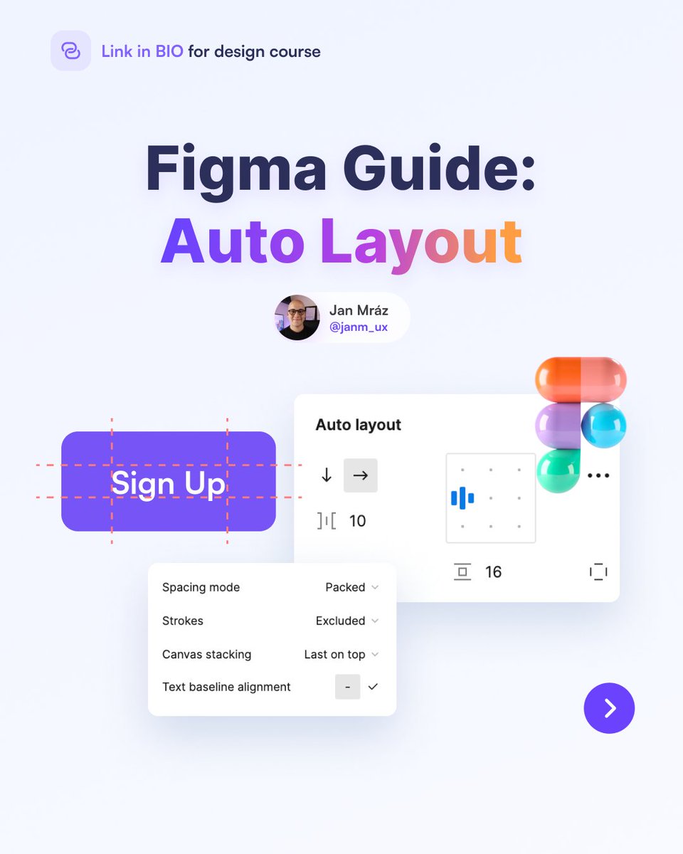
Autolayout is one of the most discussed Figma functionality. Discover the key points about this feature in the thread below! 👇 Retweets are highly appreciated! 💜 pic.twitter.com/JrLmOXJ4Jg
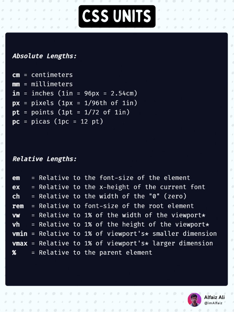
CSS Units CheatSheet for Frontend Developers 🗃️ pic.twitter.com/zffEoQ8efw
CSS Flex for speed-learners ~ pic.twitter.com/xomtKRTxvO
🎨 An endless collection of accessible color combinations: randoma11y.com pic.twitter.com/UxHWdSBB3R
CSS text typewriter animation in 48 seconds. 🔗 codepen.io/prathkum/pen/q… pic.twitter.com/STIWm5IJ9W
good icons are hard to find, here's the best places to find them: —phosphoricons.com —icons.radix-ui.com —iconoir.com —iconic.app —feathericons.com —remixicon.com —heroicons.com —tablericons.com
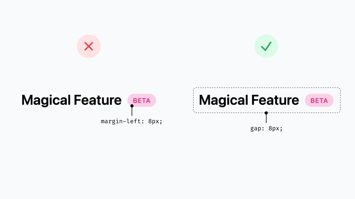
I follow one rule for painless and consistent spacing — never define margin inside components. Define spacing on the container element instead that positions these components. This way you're always in control of the layout💄 pic.twitter.com/IejikBEr20
I often slave over in-program microcopy. Tip: when crafting an error message for users, frame it as answering these three questions: 1. What just happened? 2. What are the implications of that happening? 3. What specific action should they take next? It just works.


